

November 25 is the official launching date for Navicat Premium 15. Currently, version 15 packs a wallop of new features and improvements, most notably in data transfers, the SQL Builder, and modeling. It also adds Data Visualization, Dark Mode and native Linux support. In today's blog we'll learn how the new Data Visualization feature helps us turn our database into visuals that provide valuable insights into our data through a wide variety of charts and graphs.
Work spaces, Data Sources, and Charts
Data visualization is the graphical representation of information and data using visual components like charts, graphs, and maps. Data visualization tools provide an accessible way to see and understand trends, outliers, and other patterns in our data.
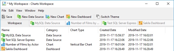
In Navicat, data visualizations are organized in a hierarchy of Workspace, Data Sources, and Charts.
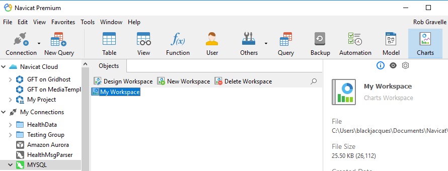
Clicking the Charts button displays the Workspace buttons in the Objects toolbar. From there, clicking on New Workspace opens the Charts Workspace window, which is all of the action happens!
Whereas typical charts are based on a snapshot of data, data visualization can be applied to live data and refreshed at any time.
In a graphical interface, a workspace is a grouping of related objects to help manage them in one place. In Navicat, it's where you'll find all of your Data Sources, Charts, and Dashboards (more on those in a bit).
A Data Source can be based on any valid database connection or even on multiple connections.
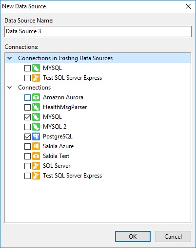
Once a Data Source's objects are available, you can drag database objects such as tables, views and queries into the main window and fetch data from them. Navicat will auto-detect relationships between database objects.
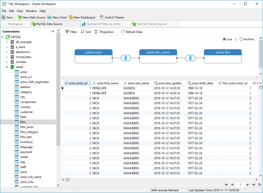
Data may be live or based on an archive. In Archive mode, Navicat takes a snapshot of the current data and bases charts on it.
Charts
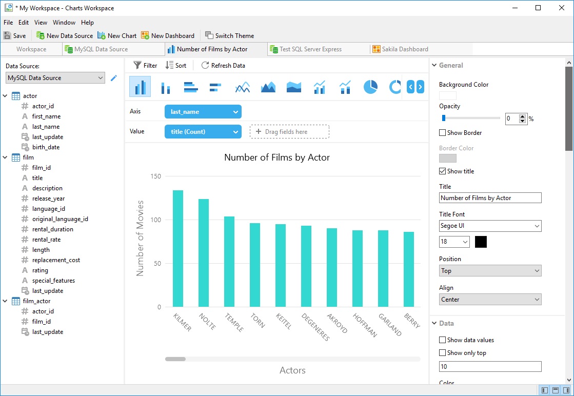
The main tool of data visualization is charts. That's why Navicat 15 includes all of the major chart types that you need to explore your data. These include (just to name a few):
- Bar
- Stacked bar
- Line
- Area
- Pie
- Donought
- Scatter
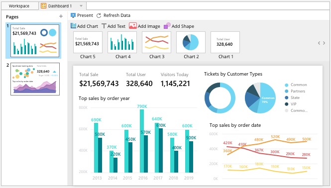
Charts are completely customizable in terms of fonts, text placement, colors, opacity, formatting, filtering, and many more. Here's an example that I created in about five minutes!
Dashboards
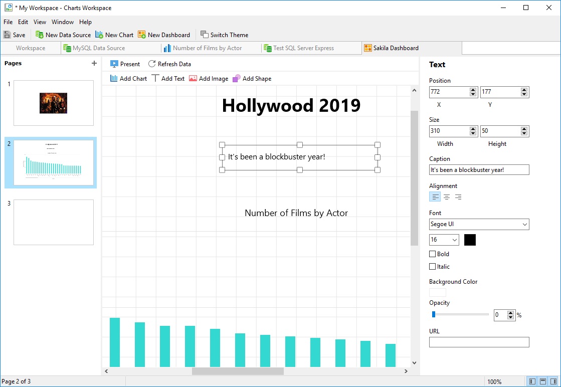
In this age of Big Data, data dashboards are indispensable to aggregate huge amounts of data from disparate sources into a cohesive and digestible whole. A dashboard displays all this data in the form of tables, line charts, bar charts and gauges. A data dashboard is the most efficient way to track multiple data sources because it provides a central location for businesses to monitor and analyze performance.
In Navicat, a Dashboard is where you can group your charts along with images, shapes, and text to create slideshow presentations for targeted groups, such as developers, data analysts, and management.
Conclusion
In today's blog we explored Navicat 15's new Data Visualization feature. We'll check out some other new features and improvements next week. In the meantime, feel free to download it and give it a whirl!


